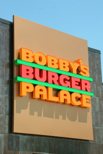
Bobby’s Burger Palace Identity
Pentagram, New York, New York, 2008
Description
The identity for Bobby’s Burger Palace, the new joint from celebrity chef Bobby Flay, makes “burger” the tasty center of a logotype sandwich that has been blessed with an even number of letters in each word, set in a customized version of Hoefler & Frere—Jones’ Knockout font. The bright colors match Flay’s bold flavors. In print applications, the graphics demonstrate his exuberant personality via Flayisms like “Bobby says we’re goin’ to the BBP” and “Bobby reminds you to ask about our topless burger.” The interior design is by the Rockwell Group, based on the lines and colors of Pentagram’s identity.
Juror Notes
Like...fun and appropriate. Makes you want to eat there. It’s like a burger joint, but better.
Collections:
AIGA 365: 30 (2009)
Repository:
Denver Art Museum
Discipline:
Brand and identity systems design
Format:
Brand and identity systems, Logo
Credits
- Design firm
- Pentagram
- Art director
- Michael Bierut
- Designers
- Michael Bierut, Joe Marianek
- Typeface
- Customized Knockout
- Client
- Bobby’s Burger Palace
Loading...
Loading...


