Larry Johnson
Green Dragon Office, Los Angeles, California, 2009
Description
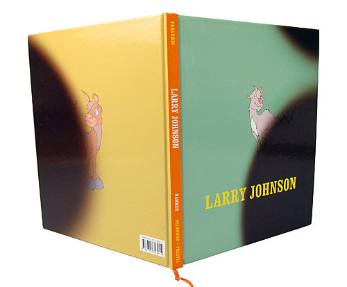
Larry Johnson’s exhibition catalogue presented special problems because his work is so “graphic,” literally made of images and typography that twist the conventions of graphic design, illustration and (somewhat anachronistic) means of graphic arts techniques to an extremely subversive effect. And while we usually like to incorporate aspects of the subject at hand when we are representing the artists’ work in their own book, here we really ran the risk of either caricaturing Johnson’s (pretty fabulous) graphic work, or we could opt for the default of the clean white space. I think we found a structure for the book that allowed us to show off his work in the context of the writings, emphasizing the readerliness of the book (for an artist who clearly prizes that same quality in his own work) and typography that is friendly (another quality of Johnson’s work, evident from the get-go with the winsome creatures on the cover).
Juror Notes
First off, I dare you to look at this cover and not smile. More importantly, the designer honors the humor and winking wit of the art throughout the entire package. Inspired finish and color choices, clearly laid out.
Credits
- Design firm
- Green Dragon Office
- Creative director
- Lorraine Wild
- Designer
- Victoria Lam
- Author
- Russell Ferguson
- Editor
- Kara Kirk


