D'Apostrophe
ZAGO , New York, New York, 2009
Description
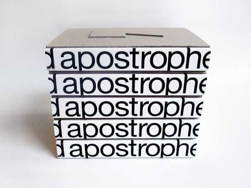
We were asked to come up with a book that not only displays, but intimately relates to the work of architect and designer Francis D’Haene: presence, simplicity and symmetry. The book cover is die-cut and designed as a structural base that supports stackable editions. Gray binder board, black Helvetica Neue type and white negative space are the generic elements used to create this shell.
Juror Notes
D’apostrophe represents the work of architect Francis D’Haene. The subject’s interest in both the physical and existential spaces we inhabit forms a contemporary view of the practitioner’s work in a handsome and clever package. The use of the two-level binder’s board to form the raised and recessed apostrophe on the front and back covers, respectively, resonates with the notion of geometry and living forms within negative and positive space.
Credits
- Design firm
- ZAGO
- Creative director
- Nereo Zago
- Art director
- Muriel Degerine
- Designers
- Muriel Degerine, Liliane Kuendig, Benjamin Lory
- Jacket designer
- Muriel Degerine
- Production artist
- Traian Stanescu
- Picture editor
- ZAGO
- Project manager
- Jenna Robles
- Author
- Francis D’Haene
- Editor
- Manuel Toscano
- Publishers/clients
- Jenna Robles, Manuel Toscano
- Trim size
- 6.25 x 8.9
- Pages
- 354
- Quantity printed
- 500
- Typeface
- Helvetica Neue
- Printer
- Oddi Printing
- Jacket printer
- Oddi Printing
- Paper
- Arctic Volume, white, 150 gsm, coated matte, text
- Binding method
- PUR perfect


