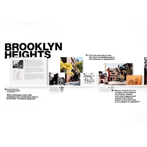
Context/Contrast
PS New York, New York, New York, 2009
Description
Playing off the main theme of the exhibit, context and contrast, this survey of new architecture in historic districts for the Center for Architecture was organized around the principle of layering. One piece of information, the context, provides the background; another piece of information, the contrast, is placed on top. This concept started with the logo and was further developed into the print material and three-dimensional exhibition graphics.
Juror Notes
Great design and conceptual solution to highlight the changing architecture in New York City.
Collections:
AIGA 365: 31 (2010)
Repository:
Denver Art Museum
Discipline:
Information design
Format:
Exhibit, Graphical interface, Logo
Credits
- Design firm
- PS New York
- Creative director
- Penny Hardy
- Designer
- Elizabeth Oh
- Architect
- Moorhead & Moorhead
- Curator
- Rachel Carley
- Client
- Center for Architecture
Loading...
Loading...


