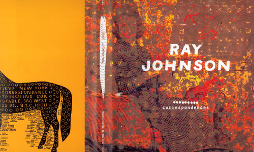
Ray Johnson: Correspondences
Heavy Meta, New York, New York, 1999
Description
Ray Johnson was once referred to as New York’s most famous unknown artist. He maneuvered around the traditional distribution systems of the art world through his invention of mail art and the “Happening,” making work that deliberately resists categorization and often plays off previous pieces and miscommunications. Hand-rendered graphic elements such as bunny heads and squiggly lines appear throughout his fabulous flyers and collages.
For this book, I wanted to “write” with Johnson, so I used some of his hand-drawn elements typographically: a series of tiny bunny heads indicate the end of an essay, while three dots on a line (referred to as ants in one of his collages) separate sections in the bibliography and checklist. I also used a monospaced version of The Sans to indicate Johnson’s quotes throughout the book that refer to his typewritten flyers. On a much more arcane level, Font Shop sells a smaller package of weights of The Sans named “Correspondence.”
Credits
- Design firm
- Heavy Meta
- Creative director
- Barbara Glauber
- Designers
- Barbara Glauber, Beverly Joel
- Editors
- Donna De Salvo, Catherine Gudis
- Trim size
- 8 1/16 x 10 5/8 inches
- Pages
- 224
- Typefaces
- Century, The Sans, The Sans Mono Condensed, Lucky State (a combination of the letters off the Lucky Strike package and Interstate Bold), Count Ferdinand (from Johnson’s hand-drawn numbers)
- Quantity printed
- 4,000
- Printer
- Pollina (France)
- Paper
- semi matte 150 gram technosatin
- Endpapers
- Detail of black shapes from a Johnson flyer printed in four color with a gloss varnish over the shapes
- Publishers/clients
- Wexner Center for the Arts, Flammarion

