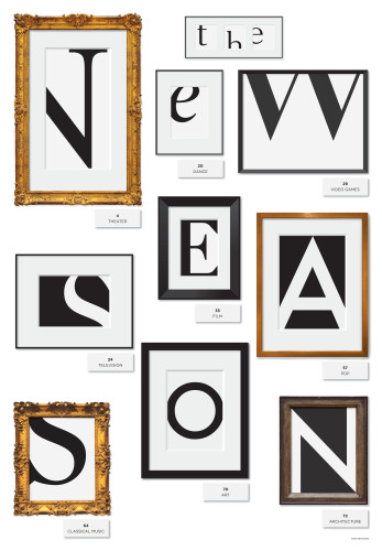
The New Season
Office of Joon Mo Kang, New York, New York, New York, 2010
Description
Project brief: The client asked me to create newspaper cover images (or anything) for “The New Season” of the Arts & Leisure section of the New York Times in two weeks. Since this special issue comes every year, the challenge was creating something that’s not been done by previous covers. “The New Season” issue of Arts & Leisure contains many different subcategories, such as theater, dance, video games, television, film, pop, classical music, art and architecture. I wanted to create a single image that could not only communicate “The New Season” but also show all subcategories at the same time.
Approach: I created a wall of a gallery opening with different cropped types in picture frames that spell “The New Season” and emphasize all subcategories. Luckily, the number of subcategories and “N E W S E A S O N” matched. :) All I had to do was run to the Metropolitan Museum of Art to take pictures of frames, make some vector frames and show the beauty of detail of typefaces.
Effectiveness: For the audience, it is easy to understand the message “The New Season” and also hard enough that they must slow down and take a look at all details at the same time. This cover was the very front cover for the Sunday edition of the New York Times. I felt I gave the audience (non-designers) a basic typography lesson, showing that type can be artistic and beautiful.
I can’t tell economically how many more newspapers were sold that day but I heard personally from a number of famous and important designers and editors who liked the cover. Here is one quote from the editor: “I just wanted to say thanks for the terrific A&L cover. It’s both elegant and striking, and totally distinctive. We’re really grateful and I’m delighted that we had a chance to showcase your work. Please stay in touch with us and we’ll hopefully be able to work together again before long.”
Juror Notes
So simple and smart, we were left wondering why it hasn’t been done before.
Credits
- Design firm
- Office of Joon Mo Kang, New York
- Creative director
- Tom Bodkin
- Art director
- Paul Jean
- Illustrator
- Joon Mo Kang
- Editor
- Scott Veale
- Publisher
- The New York Times
- Client
- The New York Times

