IBM Smarter Planet, Business Services
Office, San Francisco, New York, New York, 2010
Description
Project brief: “The world will continue to become smaller, flatter and smarter. We are moving into the age of the globally integrated and intelligent economy, society and planet. The question is, what will we do with that?” —Samuel J. Palmisano, IBM Chairman and CEO
In the midst of the meltdown of the U.S. financial system, the ongoing consequences of a global energy crisis and a broken health-care system, IBM recognized a unique opportunity to provide new leadership. They wanted to show the world that the thinking and technology needed to solve the world’s biggest problems exists today.
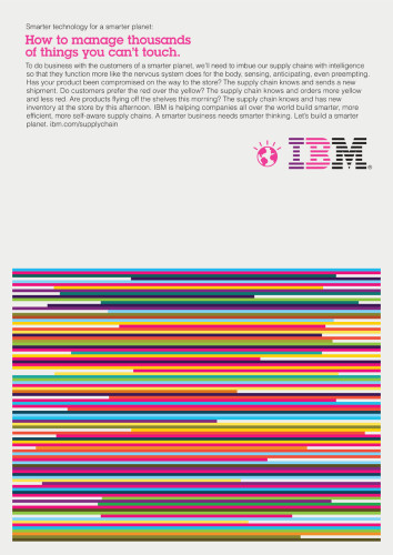
Ogilvy & Mather New York asked Office to develop a visual vocabulary for the launch of IBM’s Smarter Planet campaign. Part of the campaign included a series of ads for IBM’s business services, targeting C-level executives.
Approach: The design challenge was to create a visually arresting language as bold as the ideas it represents. How do we create something that will grab people’s attention and engage them so they want to learn more? How do we distill complex essays into one clear visual concept? And how do we represent these big, complicated problems in a way that’s approachable?
The Office team was inspired by the creative vision that designer Paul Rand developed for IBM in the ’50s, ’60s and ’70s. Rand’s work was about boldness and clarity, and had a “wink” that created an emotional connection with people. These became the team’s driving principles.
One ad, for example, focused on the more than 43,000 gigabytes of data that are generated by trillions of objects every day. IBM’s advanced analytics help businesses use this data not just to see what’s happening today but also to predict what’s coming next. Office illustrated this concept of spotting patterns and crystallizing trends to make smarter decisions.
Effectiveness: The Smarter Planet campaign has been exceeding its goals, and has generated responses from leading corporations.
Juror Notes
A combination of information, graphics and art that fits the brand really well. And they’ve been able to do it multiple times successfully.
Credits
- Design firm
- Office, San Francisco
- Creative directors
- Tom Godici, Greg Ketchum, Chris Wall, Susan Westre (Ogilvy & Mather)
- Art directors
- Jason Schulte, Lew Willig (Ogilvy & Mather)
- Designers
- Rob Alexander, Will Ecke, Jason Schulte
- Illustrators
- Rob Alexander, Will Ecke
- Writer
- Rob Jamieson (Ogilvy)
- Client
- Ogilvy & Mather New York