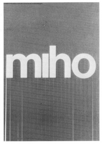
Miho, exhibition announcement poster
Miho Inc., 1971
Description
Juror Notes
As I recall, all the judges were immediately attracted to this
poster, and I think the appeal went beyond the tactile fun
of the poster's shreds. I think what we are looking at here is
an unconscious rebellion against the (by now) suffocating
influence of Bauhaus graphics. Forty years ago Bauhaus
graphics were fresh and exhilarating, because they seemed
to remove all the clutter. Today Bauhaus graphic design,
like Bauhaus architecture, is worse than overused. . . it has
become a pall, a monumental tedium, bad as a whole town
full of Victorian gingerbread. It's everywhere, it's on the
men's room door. I think that what happened with this
entry was that the artist executed a classic Bauhaus
poster—and was suddenly overcome by a marvelous
impulse: "I'll give the damned thing a grass skirt!" There
are, of course, no more antithetical design motifs than
Mondrian/Gropious/Bauhaus on the one hand—and the hula
on the other. To clinch the point, the artist originated the
grass skirt right in the middle of MIHO itself. (Rolls Royce
was overcome by the same impulse in 1911; they had an
artist add that marvelously loony woman as a radiator
cap. . . those aren't wings you see on her, they're flowing
robes. . . a pure piece of Art Nouveau fantasy. . . They had
finally had it up to here with that goddamned unyielding
Greek Temple that the radiator grille is modeled after. They
put Wild Minnie up on top to try to get something going.)
-Tom Wolfe
Paper can be easily shredded but Miho (James and
Tomoko) cannot.
—Gene Federico
Credits
- Design firm
- Miho Inc.
- Art director
- Miho
- Designer
- Miho
- Client
- Dai Nippon Ink/Dic Gallery